RELIEF
Mental Health App Design
This is a project that I've been assigned to as part of an UI/UX Design Course I have been attending for three months at IT School Timisoara.
Target Audience: a wide range of users, from adolescents to middle-aged, who are searching for tools to deal with everyday stress and burnout
Timeline: Aug - Sep 2023
UI/UX Design - research, definition & ideation,
visual design, prototyping, testing iteration
visual design, prototyping, testing iteration
Overview
As part of the design challenge to create an app as a solo designer, I managed to test my workflow and to come up with solutions by applying the design thinking process methodology.
Stress is a comon issue to the society nowadays and the need of an app sounded like a good idea, so I decided to identify what is missing on the market and what needs can be met with a better solution.
Challenges & Solutions
Given the relatively short timeline of 3 weeks, the challenge was to provide reliable online tools for users who explore ways to reduce stress. Although there is growing interest in using mobile apps for mental wellbeing, the degree of engagement appears to be affected by factors such as the lack of relevant content, limited free resources or the generic and impersonal approach.
With the user needs in mind, Relief App wants to offer a more personalized approach, a safe space and customized recommendations based on the personality of each individual user.

EMPATHIZE
Competitor Analysis
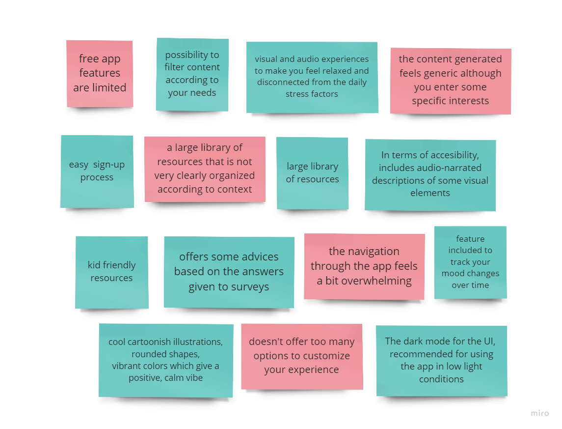
I started the research process by identifying competitors in the mental health industry and gaining insight on their strengths and weaknesses, searching at the same time features nice to have that are missing in some apps. I based my research on the users’ reviews as well to learn more about their feelings and needs related to the products they use.
There were a lot of competitors in this field. So I took 3 out of them, which were considered some of the top competitors - Headspace, Calm and Tripp.
As a main feature to take into consideration, for better accesibility, it would be nice to implement light theme and night theme for different sections of the app. This would be useful to distinguish better between wind down activities specific for evening or a good night sleep and those specific for daytime.
User Interviews
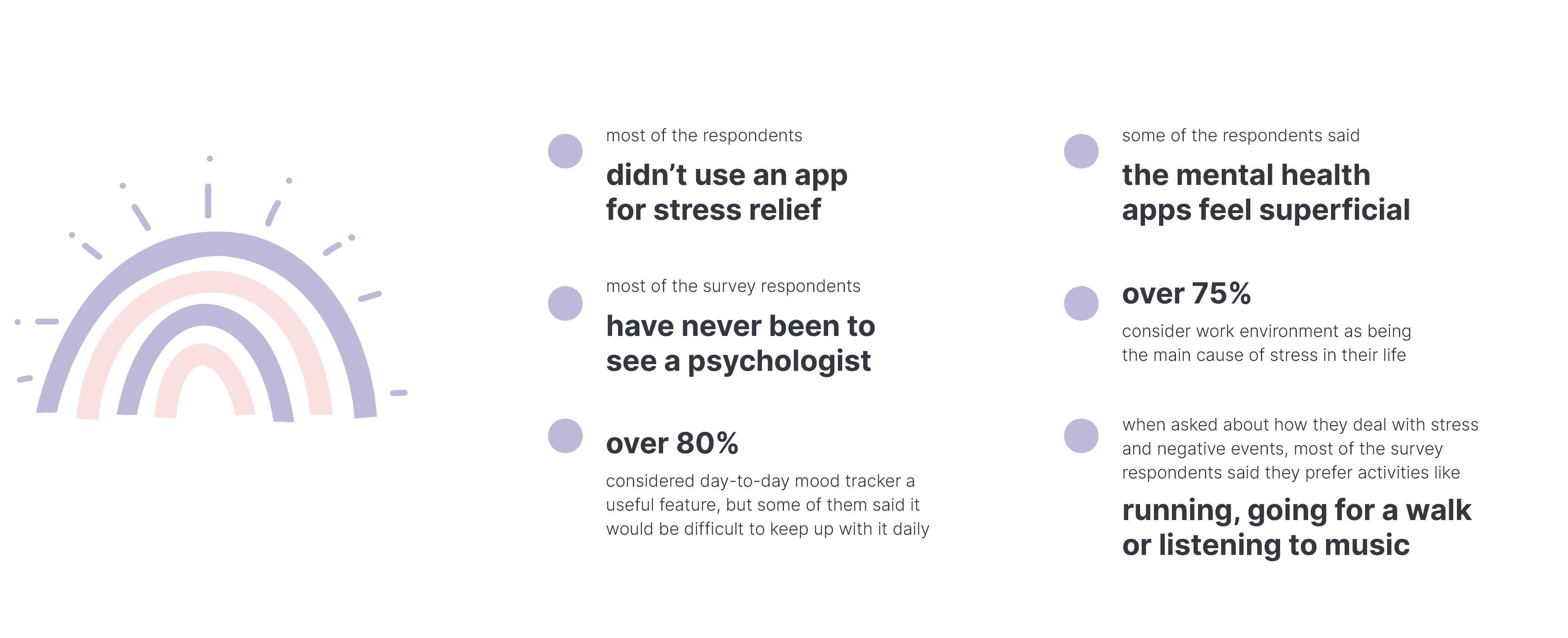
For the next step, I conducted remote and in person interviews. I asked most of them to complete a Google Forms survey and I collected data from 12 respondents.
The findings revealed interesting insights into users’ attitudes towards relaxation and stress reduction techniques. Contact with nature, experiencing natural sounds or looking at beautiful views were reported as effective ways to reduce stress.
My research goals included:
1. to analyze what are the main causes of stress
2. to find how they handle stressful situations in their daily life
3. to discover what features they would consider useful in a mental health app and what would they actually find helpful
All the data from interviews allowed me to to get a better understanding of the target users and their common behaviors, that would set the foundation for defining the user persona.
Some key findings included:
DEFINE
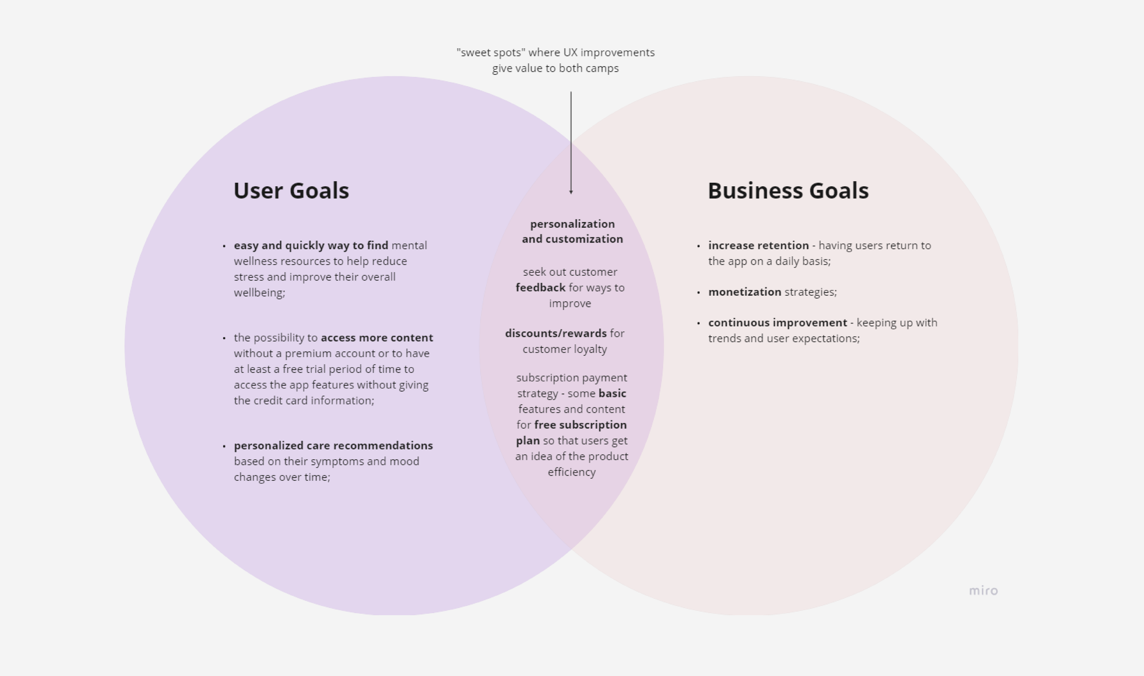
User Goals vs. Business Goals Diagram
Based on all the data collected and all the insights gained until this point, I created a user goals vs. business goals diagram in order to find the perfect balance for both and to establish a win-win solution that rewards both sides.
User Persona
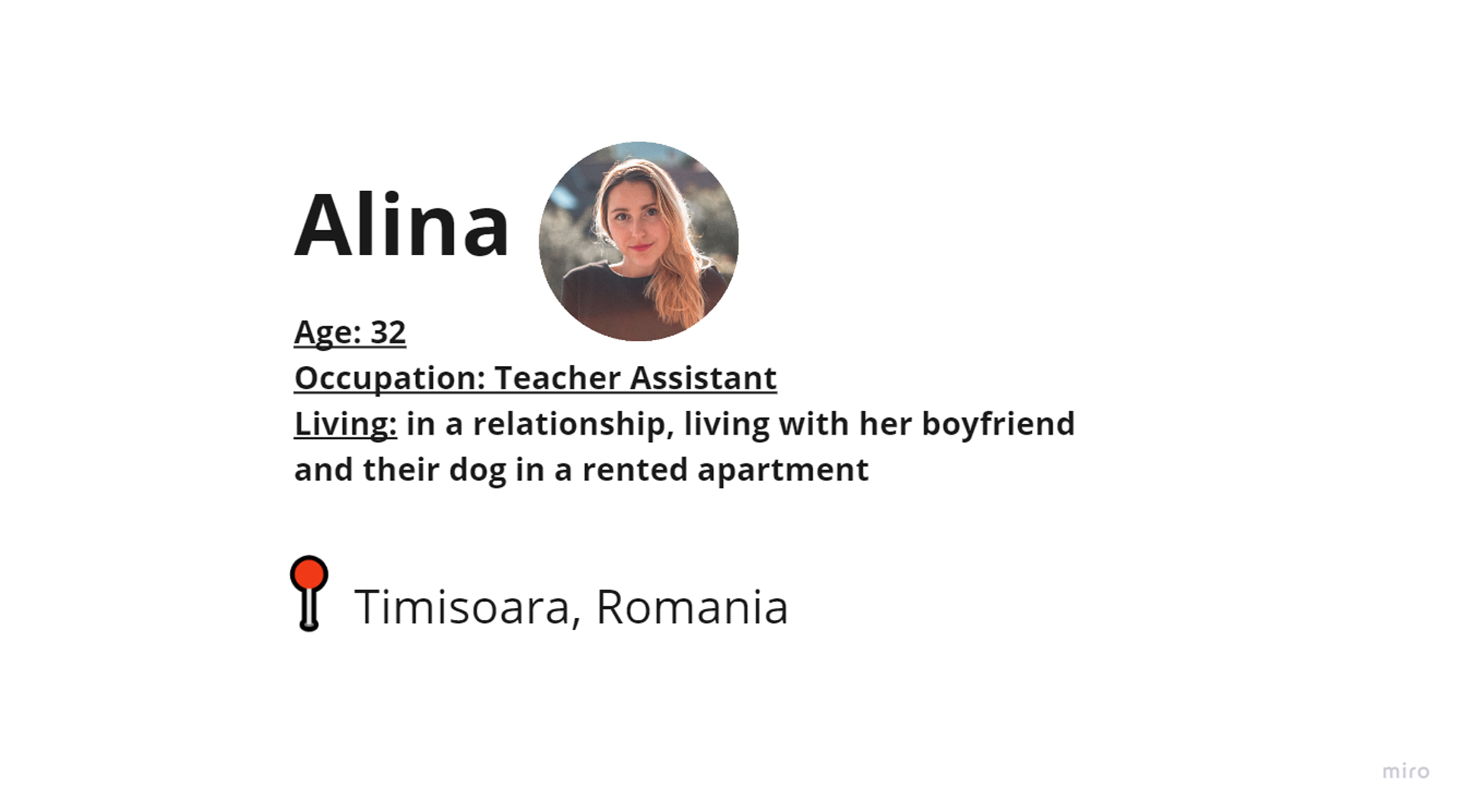
Based on all the data gathered until this point, I created a user persona that defines the target user.
Meet Alina
A young teacher assistant, living with her boyfriend in a rented apartment. Her main goal is to manage stress and anxiety. Main causes of her worries are work related and she struggles to find the balance between personal and professional life. She even considered going to a therapist, but she has a busy schedule and the sessions are too pricey for her budget. She's using a mental health app, but it's time consuming and frustrating to find the content she needs and is difficult to track her progress while using the app. Besides, the price for the app is too high for the benefits she's getting from using it.
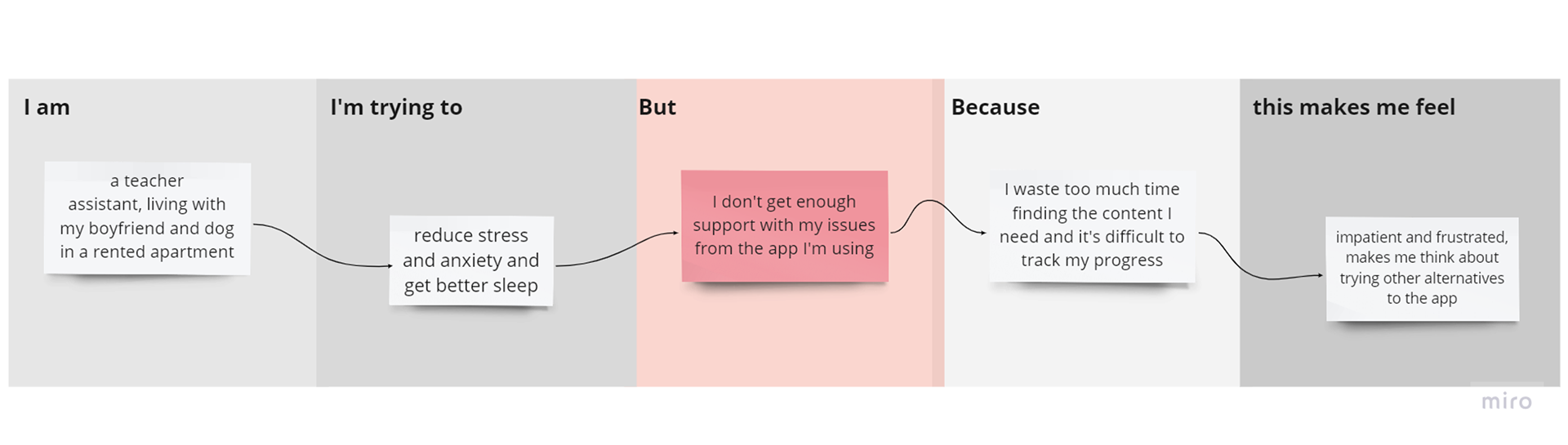
Defining the user persona gave me a good context to identify pain points that my target audience may experience while using the app. During the discovery step of the process, I wanted to address the main problem that requires a solution. Spending more time upfront to identify and frame the problem gave me a better perspective so I can focus on what I know at this point and identify opportunities for improvement.
IDEATE
Everything I learned in the empathy phase while doing user research helped me define what Relief App should become. It should be designed to help users like Alina get free access to most of the basic features of the app, with the posibility to get a paid subscription in the future to unlock more features, in order to get an even more customized plan according to her needs.
Brainstorming
During the braindump exercise, I wrote ideas freely, as they came, related on topics about the mental health app. The brainstorming session allowed me to select the most important features for the target users and prioritize them through a card sorting exercise, that helped me outline more clearly the MVP features.
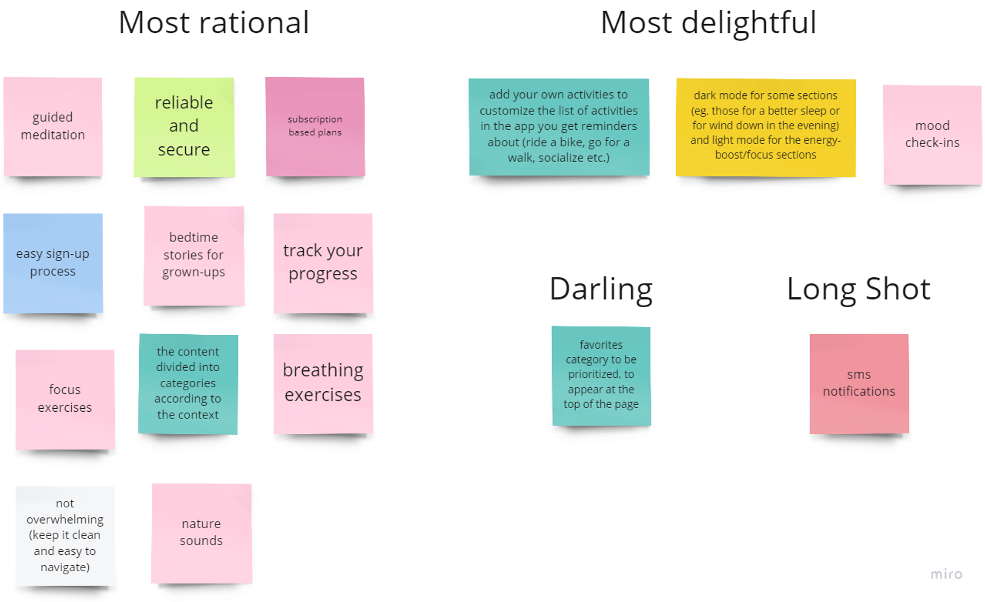
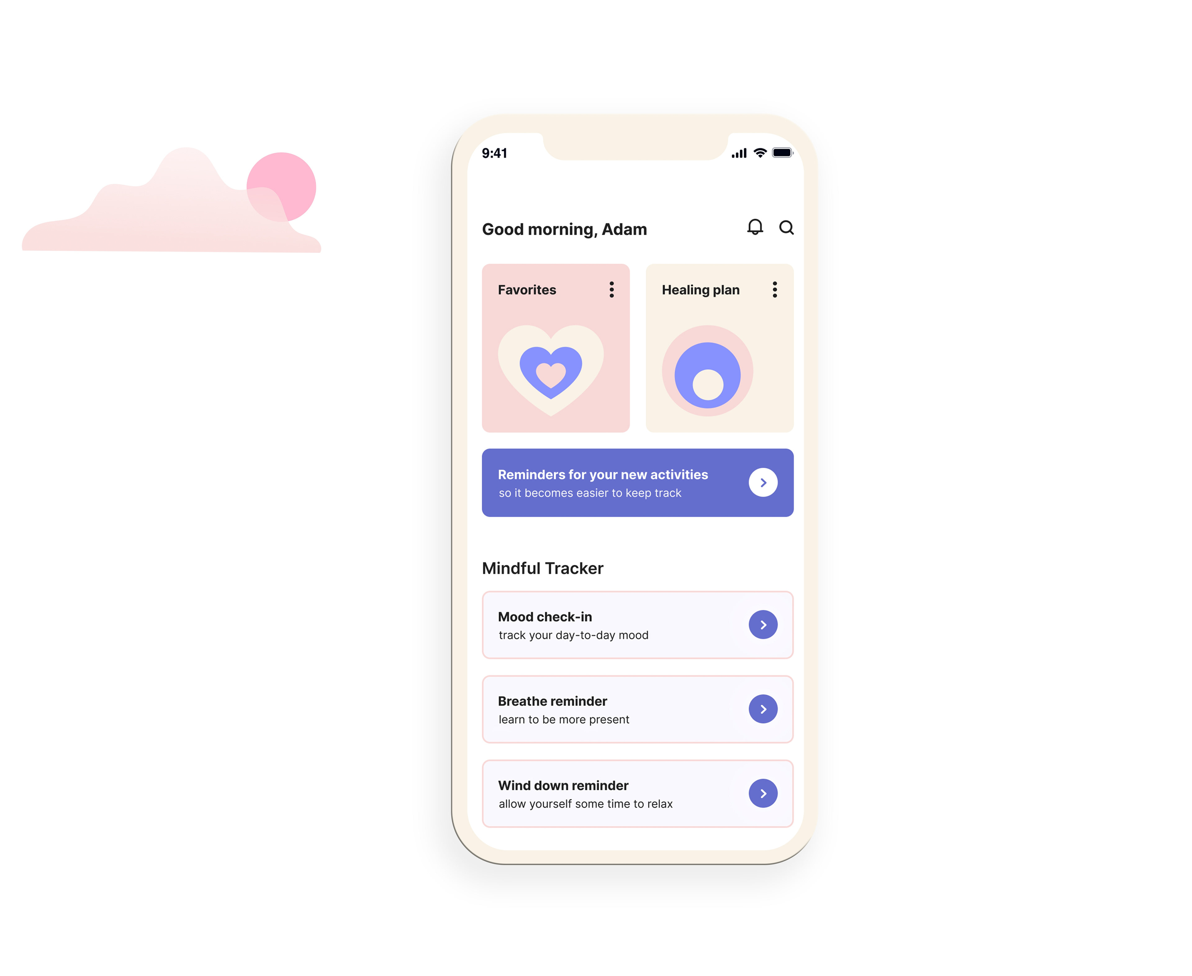
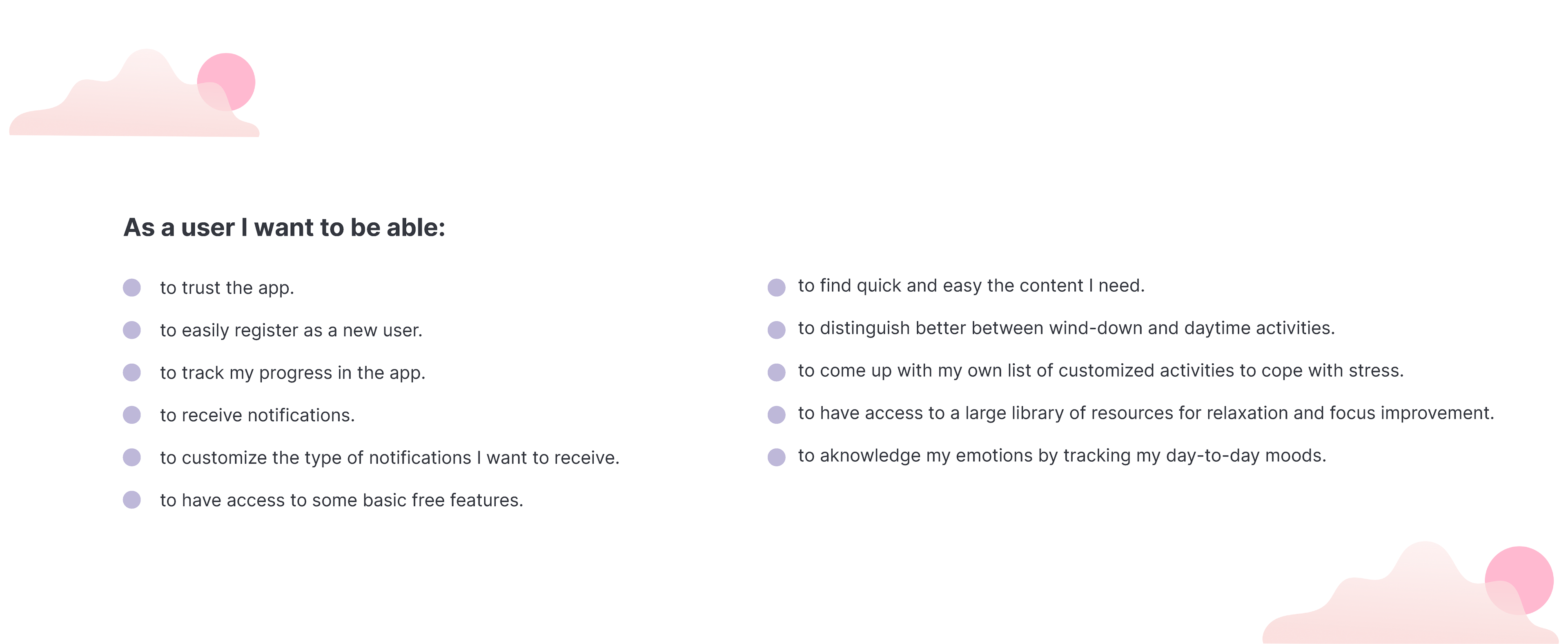
MVP features
Based on the main features to be taken in consideration for the minimum viable product, I decided on the following characteristics as basic and mandatory to be included:
MOVING ON TO PROTOTYPING
In this step of the process, I played with different ideas and made several changes until I found solutions for different needs of the target user, by focusing on finding the most intuitive flows and interactions between elements and screens of the app.
Planning
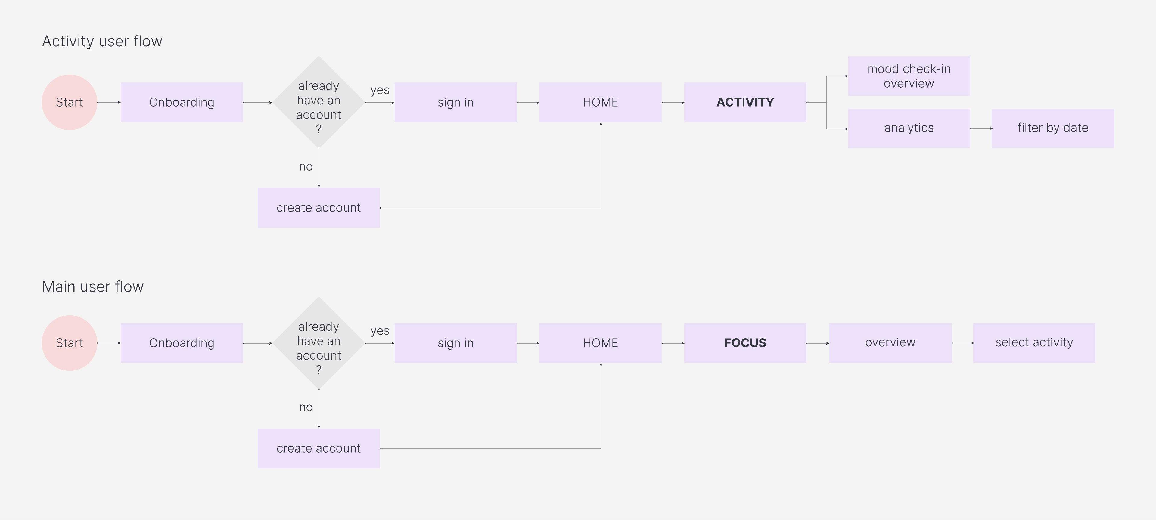
I created user flows based on common tasks that the target user would do in different steps of the app.
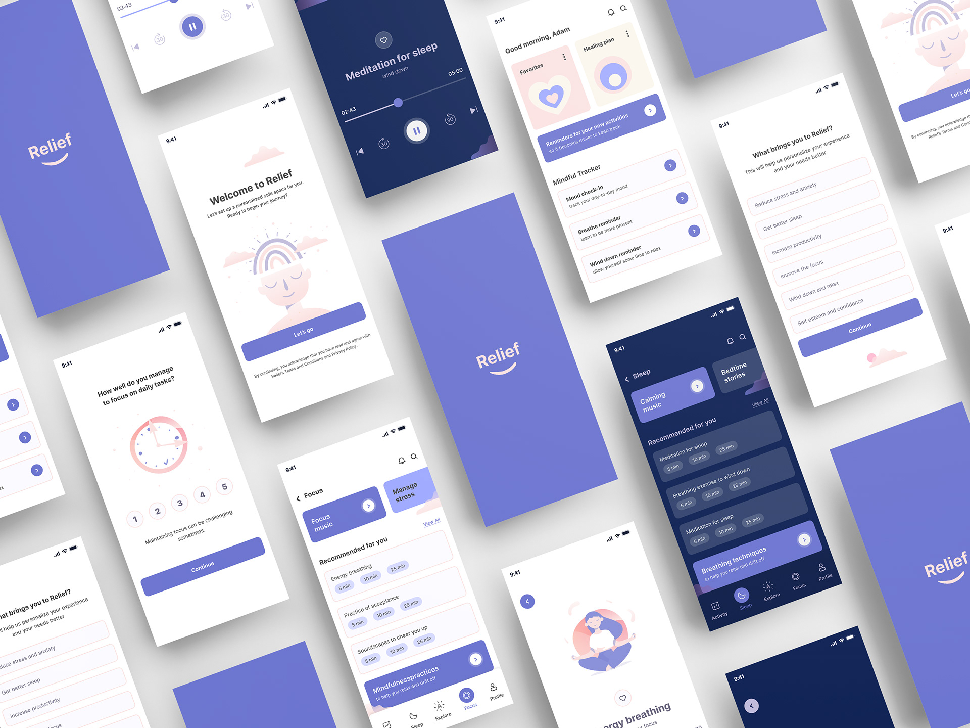
Design stage
I started with a moodboard, to set the visual style and tone of the project.
Due to time constraints, for the mid-fidelity digital wireframes I had to focus on the core features of the app.

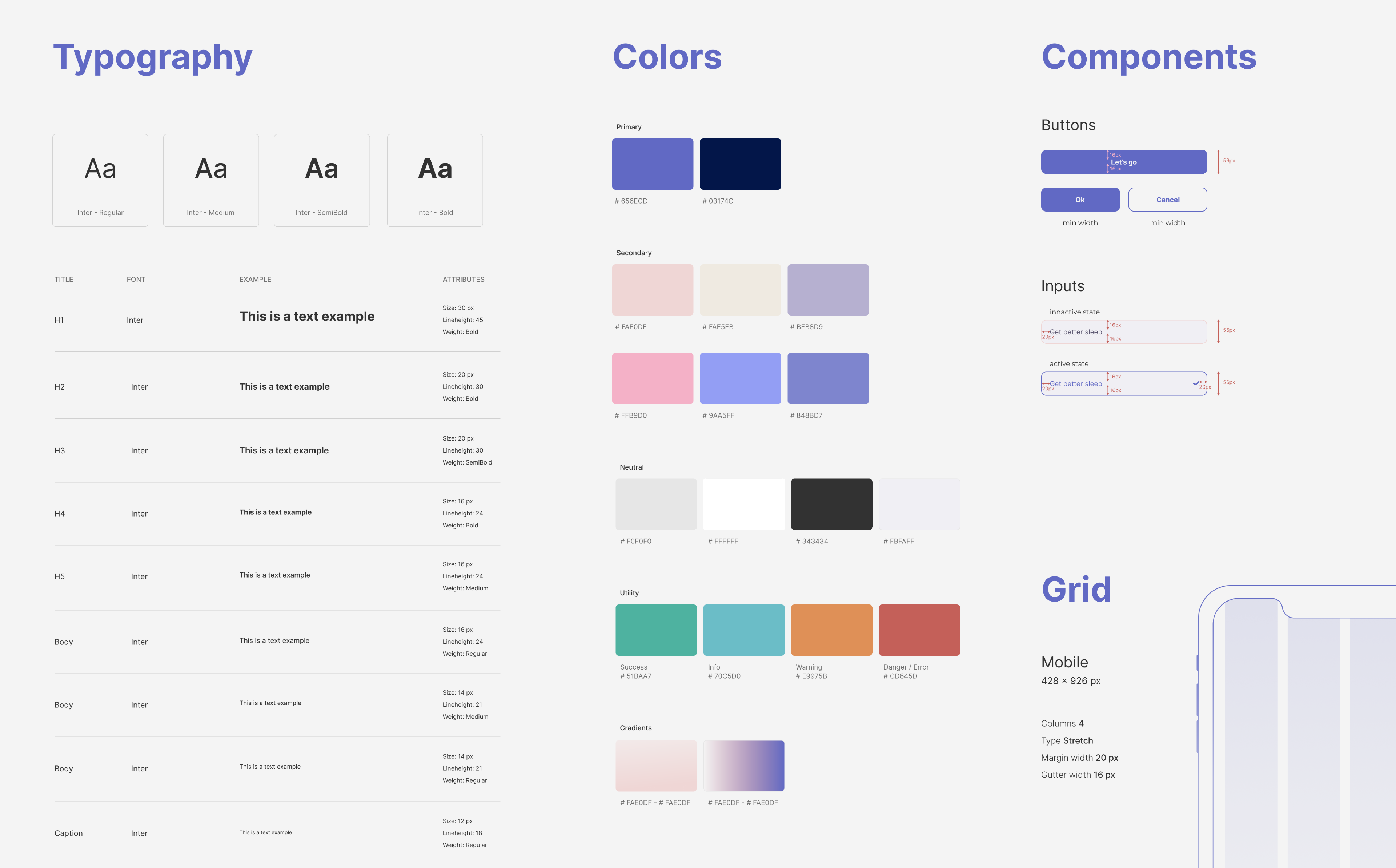
Styleguide
I took into consideration the following principles, when designing the screens:
• the legibility (I made sure that the texts are legible and readable)
• the accessibility (I focused on maintaining high enough contrast)
• the hierarchy (I emphasised the general purpose of the screens and included clear CTA-s)
• the accessibility (I focused on maintaining high enough contrast)
• the hierarchy (I emphasised the general purpose of the screens and included clear CTA-s)
I chose faded colors and slightly rounded buttons to generate a calm, positive vibe.